微信小程序新手教程组件学习入门
- 时间:2017-01-05 16:55
- 来源:下载吧
- 编辑:xwgod
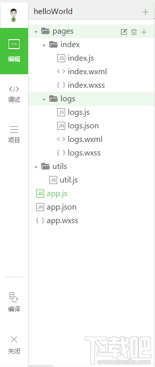
微信小程序新手教程组件学习入门,本篇默认已经成功安装微信小程序工具,来和小编一起看看吧
微信小程序框架提供的基础组件有八类
一:视图容器 view Container
包括:
view 视图容器
scroll-view 可滚动视图容器
swiper 滑块视图容器
view:感觉跟html里的div对应,官方文档里给出的例子是:
但实现效果跟它给出的效果图不一致,style里的flex-direction设置并没有实现
scroll-view:各项属性
scroll-x:允许横向滚动
scroll-y:允许纵向滚动
upper-threshold:距顶部/左边多远时(px),触发scrolltoupper事件
lower-threshold:距底部/右边多远时,触发scrolltolower事件
scroll-top:设置竖向滚动条位置
scroll-left:设置横向滚动条位置
scroll-into-view:值应为某子元素id,则滚动到该元素,元素顶部对齐滚动区域顶部
bindscrolltoupper:滚动到顶部/左边,会触发scrolltoupper事件
bindscrolltolower:滚动到底部/右边,会触发scrolltolower事件
bindsroll:滚动时触发
使用竖向滚动时,需要给scroll-view一个固定高度
=======================================================================================
.wxml代码
<scroll-view class="scroll-view" scroll-y="true" p="" <="" bindscrolltolower="lower" bindscrolltoupper="upper">
bindscroll="scroll" scroll-into-view="{{toView}}" scroll-top="{{scrollTop}}">
.wxss代码
.bc_green{
background:green;
}
.bc_red{
background:red;
}
.bc_blue{
background:blue;
}
.bc_yellow{
background:yellow;
}
.scroll-view-item{
width:200px;
height:200px;
}
.scroll-view{
width:100%;
height:400px;
}
.js代码
var order=['red','yellow','green','blue','red']
Page({
data:{
toView:'red',
scrollTop:200
},
upper:function(e){
console.log(e)
},
lower:function(e){
console.log(e)
},
scroll:function(e){
console.log(e)
},
tap:function(e){
for(var i=0;i<order.length;++i){< p="">
if(order[i]==this.data.toView){
this.setData({
toView:order[i+1]
})
break
}
}
},
tapMove:function(e){
this.setData({
scrollTop:this.data.scrollTop+10
})
}
})
swiper滑块视图容器
属性:
indicator-dots:是否显示面板指示点(类似于我们做轮播那几个点击可切换的圆点)
autoplay:是否自动切换
current:当前所在页面的index
interval:自动切换时间间隔
duration:滑动动画时长
bindchange:current改变时会触发change事件
注意:其中只可放置swiper-item组件,其他节点会被自动删除
swiper-item仅可放置在swiper组件中,宽高自动设置为100%
把官方文档里的例子写出来发现,这个swiper滑块视图容器是可以用来做轮播图的
.wxml代码
<swiper p="" <="" interval="{{interval}}" autoplay="{{autoplay}}" indicator-dots="{{indicatorDots}}">
duration="{{duration}}">

.js代码
Page({
data:{
imgUrls:[
'../../img/7.jpeg',
'../../img/10.jpg'
],
indicatorDots:false,
autoplay:false,
interval:5000,
duration:1000
},
changeIndicatorDots:function(e){
this.setData({
indicatorDots:!this.data.indicatorDots
})
},
changeAutoplay:function(e){
this.setData({
autoplay:!this.data.autoplay
})
},
intervalChange:function(e){
this.setData({
interval:e.detail.value
})
},
durationChange:function(e){
this.setData({
duration:e.detail.value
})
}
})
效果图:

二:基础内容
包括
icon 图标
text 文本
progress 进度条
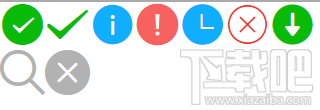
icon:属性只有三个
type 类型,有效值:success,success_no_circle,info,warn,waiting,cancel,download,search,clear(跟bootstrap似的,不同类型显示的样式不同)
size 大小,单位是px
color 颜色
大小和颜色就不说了,我试试不同类型的显示样式
代码:
.wxml
.js
Page({
data:{
iconType:[
'success','success_no_circle','info','warn','waiting','cancel','download','search','clear'
]
}
})
效果图:
text文本用法简单
而且是行内元素,不独占一行
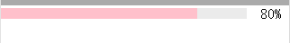
progress进度条
属性
percent 百分比0~100
show-info 在进度条右侧显示百分比
stroke-width 进度条的宽度,单位px
color 进度条颜色
active 进度条从左往右的动画(用这个的时候进度条自动从左往右动画到设定好的百分比数)
代码:
效果图:
最近更新
-
 淘宝怎么用微信支付
淘宝微信支付怎么开通?9月5日淘宝公示与微信
- 2 手机上怎么查法定退休时间 09-13
- 3 怎么查自己的法定退休年龄 09-13
- 4 小红书宠物小伙伴怎么挖宝 09-04
- 5 小红书AI宠物怎么养 09-04
- 6 网易云音乐补偿7天会员怎么领 08-21
人气排行
-
 腾讯qq6.1版本官方下载
腾讯自QQ5.x开始便不再沿用年份命名,比如QQ2014、QQ2015,而是改
-
 微信小视频保存在手机哪个文件 微信小视频保存路径
微信小视频保存在手机哪个文件。很多人都在玩微信的小视频这个功
-
 QQ聊天中图片一直显示在缓冲显示不出来解决办法
QQ聊天中图片一直显示在缓冲显示不出来解决办法。很多人都会遇到
-
 微信电脑版听不到语音消息解决方法大全
微信电脑版相比手机端聊天更加方便与快捷了,但是有的网友电脑因
-
 QQ群视频限制2小时怎么办 QQ群通话限时破解教程
QQ6.1版本之后,QQ群视频不仅改名为QQ群通话,而且还改成了普通用
-
 微信头像尺寸大小(附裁剪方法)
微信头像对图片的尺寸大小并没有限制,但尺寸太小(分辨率/像素过
-
 QQ会员VIP8怎么升级 QQ超级会员8级SVIP8升级规则/地址
QQ超级会员8级,即SVIP8经过一段时间的内测后已经正式发布了。qq
-
 微信好友删除怎么找回?微信好友删除还能找回来吗?不小心将好友的微信号删除了怎么办?
微信是我们常用的软件,但是在使用过程中,有可能碰到删错了人或
-
 手机QQ群匿名聊天功能怎么用 qq群匿名聊天开启及关闭使用教程
手机QQ群匿名聊天功能怎么用qq群匿名聊天开启及关闭使用教程。手
-
 手机QQ照片保存在哪里 聊天/接收图片保存路径
手机QQ聊天、接收照片的时候选择了保存到手机,但是还是不知道保